CSS3
样式
border-raduisborder-imagebox-shadowbackground-sizebackground-originbackground-image可以同时用几个图片了,多重背景图片text-shadowtext-wrap@font-face
用户界面
- resize 搭配overflow 指定用户是否可以调整该元素的大小
- none: 默认
- both: 无法调整
- horizontal: 可调整宽度
- vertical: 可调整高度
- box-sizing
- content-box:默认值 W3C标准模式 width/height = width/height(不包括padding border)
- border-box:怪异模式 width/height = border+padding+width/height
- inherit:从父级继承
- outline-offset 搭配outline属性看效果 轮廓不占用空间
- length: border往外的距离
- inherit
弹性盒子 Flex Box
弹性盒子flexbox是CSS3的一种新的布局方式,当屏幕大小不同,设备类型不同时,采用flexbox就会对容器中的子元素进行合理的分配,合理的排列对齐,合理的分配空白。
flexbox = flex container + flex items
-
- flex
1
2
3
4
5
6
7
8
9
10
11
12
13
14
15
16
17
18
19
20
<style>
.flex-container{
display:flex;
width: 400px;
height: 250px;
background-color: #bdc3c7
}
.flex-item{
background-color: #2980b9;
width: 100px;
height: 100px;
margin: 10px;
}
</style>
<div class='flex-container'>
<div class='flex-item'>item1</div>
<div class='flex-item'>item2</div>
<div class='flex-item'>item3</div>
</div>
- flex
-
- row
- row-reverse
- column
- column-reverse
1
2
3
4
5
.flex-container{
display:flex;
flex-direction:row;
...
}
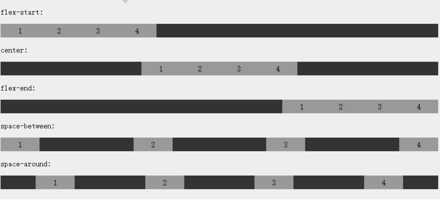
justiify-content flex-items沿着flex-container的主轴线main axis对齐
- flex-start: 居左 不分割
- flex-end: 居右 不分割
- center: 居中 不分割
- space-between: 只中间分割
- space-around: 环绕分割
align-items flex-items沿着flex-container的纵轴对齐
- flex-start: 居上 items没height,延伸到自身内容的height
- flex-end: 居下 items没height,延伸到自身内容的height
- center: 居中 items没height,延伸到自身内容的height
- baseline: 居上 items没height,延伸到自身内容的height
- stretch: 居上 items没height,延伸到container的height
flex-wrap flex-container的子元素换行方式 container.width > item.width
- nowrap:默认 item.width溢出
- wrap:溢出的item 换行放置 断行(上下)
- wrap-reverse:(下上)
align-content 用于修改flex-wrap非nowrap时的行为,不是修改item的对齐,而是修改各个行的
- stretch:默认 每一行会伸展一部分height,均匀占满空间
- flex-start:向上挤
- flex-end:向下挤
- center:居中
- space-between:中间分割
- space-around:环绕分割
flex-item的属性
- order 通过整数大小来定义item的排列顺序,小的在前,可以为负
- margin 完美居中
- align-self 设置item自身在纵轴上的一个对齐方式
- auto
- flex-start
- flex-end
- center
- baseline
- stretch
- flex flex-item如何分配空间
多媒体查询 Media Quiery
1 | @media not|only mediatype and(expresstions){ |
操作符
- not
- only
多媒体类型
- all:所有多媒体设备
- print:打印机
- screen:电脑、平板、智能手机
- speech:屏幕阅读器
网格布局 Grid
Grid VS Flex:
- Gird是二维布局:将容器划分为 行 和 列,产生单元格,然后指定项目所在那个单元格 。
- Flex是一维布局:轴线布局,只能指定项目相对于周线的位置。
最外层div是容器,内层的3个div是项目,项目是能是容器的顶层子元素,不包含p元素:
1 | <div> |
基本概念:
- 容器 & 项目
- 行 & 列
- 单元格
- 网格线
- 容器属性
- display 设为网格布局以后,容器的项目的float、diplay:inline-block|table-cell、vertical-align等设置都将失效。属性值:
- grid:块级
- inline-grid:行级
- grid-template-columns
- grid-template-rows 关键字如下:
- repeat()
- auto-fill
- fr
- minmax
- auto
- 网格线名称
- 布局实例
- grid-row-gap
- grid-column-gap
- grid-gap
- grid-template-areas
- grid-auto-flow
- row
- column
- row dense
- column dense
- justify-items
- start
- end
- center
- stretch
- align-items
- place-items
- justify-content
- start
- end
- center
- stretch
- space-around
- space-between
- align-content
- place-content
- grid-auto-columns/grid-template-columns
- grid-auto-rows/grid-template-rows
- grid-template= grid-template-columns + grid-template-rows + grid-template-area
- grid= grid-template-columns + grid-template-rows + grid-template-area + grid-auto-rows + grid-auto-columns + grid-auto-flow
- display 设为网格布局以后,容器的项目的float、diplay:inline-block|table-cell、vertical-align等设置都将失效。属性值:
- 项目属性
- grid-column-start
- grid-column-end
- grid-row-start
- grid-row-end
- grid-column
- grid-row
- grid-area
- justify-self: 与justify-item效果一样,只是作用在单个item上
- align-self: align-item效果一样,只是作用在单个item上
- place-self: place-item效果一样,只是作用在单个item上
声明:本站所有内容仅供个人学习娱乐笔记所用,如涉侵权,请联系删除